
If you have sat in a board pack review, a risk committee, or an ICAAP-style discussion, you have seen a risk matrix or heat map. Usually it is a 5×5 grid: likelihood on one axis, impact on the other, risks plotted as dots or bands of colour. It is still the default way risk gets shown to leadership - not because any single supervisor mandates that layout, but because it answers one question quickly: where is the portfolio concentrated?
The common pitfall is not choosing a 5×5 layout in itself. It is letting the grid become the artefact while the definitions underneath - money, non-financial harm, credible frequency - stay implicit. Heat maps work best when paired with clear methodology: what each band means, how scores relate to controls, and who is accountable. The sections below cover what the visual does well, where it diverges from real loss, and what typically belongs alongside it - including gross vs net vs residual, assessment method, how packs get built, and risk ownership.
Why committees still want the visual first
A long register does not answer where should we focus this quarter? A heat map gives a portfolio shape: top-right clustering, empty corners, quarter-on-quarter movement. That matches how board-level risk reporting is often consumed: scan, then drill. For the operational cadence behind the pack, see how ERM teams produce board-ready reports on a recurring cycle.
Supervisors care that oversight is real, not that you picked five bands instead of four. What gets challenged is whether the board sees consistent, comparable material risk information - which is why the same visual language across divisions still matters, even when risk specialists know the limits of ordinal scoring.
Where the picture diverges from the loss
Ordinal scales are not money. A "4" on impact is not twice a "2" in any arithmetic sense. The gap that bites in practice is different: two risks can share a cell while one implies a manageable fine and another implies franchise-level harm - unless financial and non-financial bands are written down. For how to build assessments that do not float, start with how to assess enterprise risk and the taxonomy of scores in gross risk vs net risk vs residual risk explained.
- Middle drift: teams avoid extreme cells; amber becomes the parking bay where challenge dies.
- Frozen dots: scores do not move until someone updates the register - calm pictures, volatile environments.
- False aggregation: averaging unrelated ordinal scores into an "enterprise" number hides more than it reveals.
The map is a cue for conversation, not proof of measurement
Treat the heat map as a way to prioritise escalation - then insist on the harm bands and frequency statements behind each position, and how that ties to appetite and the wider ERM framework. Without that, you have a picture without a ledger.
Mitigations: what must sit under the heat map
The strongest mitigation is not a prettier chart. It is understanding the financial and non-financial harm your bands actually encode. A cell is useless unless there is shared agreement on what impact each level describes, how often events are expected to materialise, and especially the financial envelope. That means replacing loose labels like "minor" or "unlikely" with definitions people can debate - for example illustrative residual loss bands such as up to £50k, £50k-£250k, £250k-£1m, sized to your materiality and ICAAP or management reporting rather than a generic template.
For non-financial harm, each level should describe what bad looks like (local supervisory interest versus national headlines or enforcement). For likelihood, use testable frequency - less than once in twenty years; a severe scenario near one in ten years; multiple events in five years - so owners can be compared to incidents and external data. That discipline connects directly to first-line RCSA discipline and to who will defend the score when challenged.
Some CROs run an annual exercise stepping from 5×5 to 4×4 to strip the soft middle - but rescaling only bites if the definitions underneath are already explicit. Separating inherent and residual (or gross and net) matters more than the count of boxes: the map should show control effect, not just raw exposure.
- One published methodology for money, non-financial harm, and frequency - reviewed when materiality shifts.
- Narrative when scores move or stick - stale dots are a governance issue, not a graphics issue.
- Escalation beyond the grid scenarios, stress, or quant where the stakes justify it - the matrix is a triage layer, not the final word.
ISO 31000, FAIR, and "not the same picture"
In practice the distinction matters more than the label on the slide: ISO 31000 is principles-based; firms often pair it with qualitative matrices for governance and documentation. FAIR and other quant models ask "what range of loss, how often?" - a different output than a single cell colour. Many regulated organisations use both: a heat map for portfolio conversation, and targeted quant or scenarios for material decisions. The 1st, 2nd and 3rd lines of defence describe where second line challenge meets first line judgement - the matrix is only the visible layer.
Risk Assessment Summary (Initia Risk)
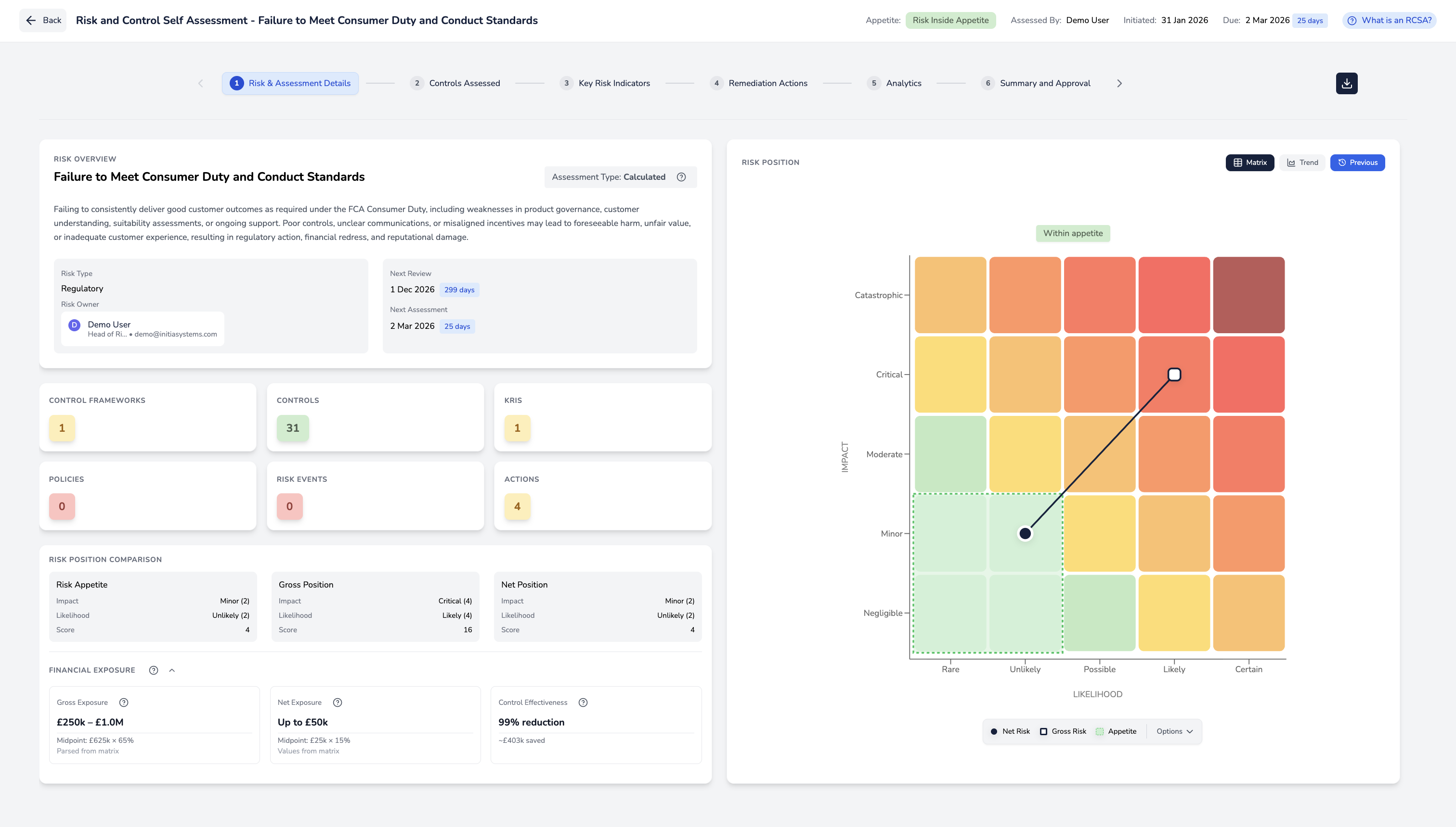
Software should make the matrix a live output of structured assessment, not a static slide pasted into PowerPoint. Below is Initia Risk’s Risk Assessment Summary - one place for positions, traceable scoring, and a visual leadership can scan while still linking back to gross and net positions and controls.
When positions, controls, and appetite live in one system, the heat map becomes an output of structured process rather than a standalone graphic - which is usually closer to what boards and supervisors expect to see.
Summary
- Under the grid: explicit financial and non-financial harm, and frequency you can test - not adjectives alone.
- Beside the grid: ownership, assessment rigour, and reporting that connect scores to decisions - the matrix cannot carry that on its own.
- Beyond the grid: scenarios or quant when the decision matters; the matrix is a triage layer.
When the spreadsheet that produces the matrix becomes the bottleneck, our buyer guide on how to choose a GRC tool walks through what to look for in a GRC platform, and the alternatives to legacy enterprise GRC suites that mid-market teams typically shortlist.

